Whether you are a seasoned data analyst or a budding statistician, displaying data in a visually appealing and easily comprehensible format is essential. One such powerful visualization tool often used to depict categorical data is the bar chart. With great potential to simplify complex data, mastering the art of creating an effective bar chart is an indispensable skill. In this article, we will delve deeper into creating compelling bar charts, their importance, and overcoming common mistakes.
Understanding the Basics of a Bar Chart
Alt text: Example of how to make a bar chart with colorful bars and a black background
A bar chart, also known as a bar graph, is a chart that presents categorical data with rectangular bars with heights or lengths proportionate to the values they represent. It is a versatile tool that can handle a wide range of data types, scales, and formats, making it highly popular in various fields.
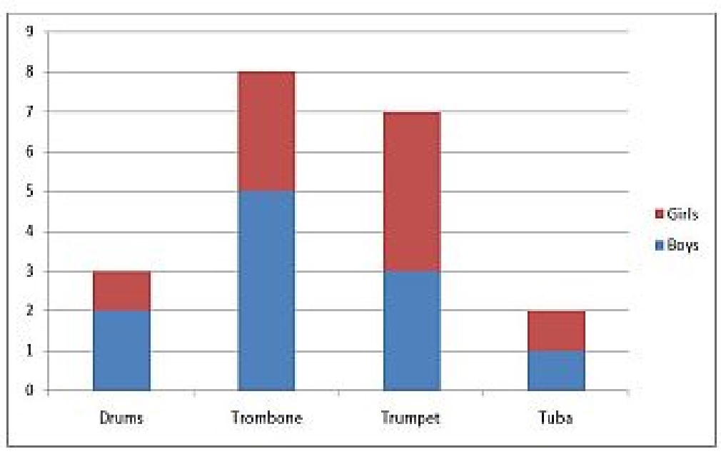
The main components of a bar chart include bars, axes, labels, title, and legend. The y-axis represents the scale and the x-axis displays the categories. Each bar corresponds to a specific category and its height or length represents its value.
Learners might often wonder how to make a bar chart. The process is quite straightforward, considering you start with a clear understanding of the fundamentals. The strength of a bar chart lies in its simplicity which aids in portraying data in an easily understandable manner.
Various types of bar charts like vertical, horizontal, stacked, or grouped bar charts exist, each catering to different needs. Moreover, a dual axis bar chart helps to compare two different measures on two different scales simultaneously.
Importance of Data Visualization With Bar Charts
Bar charts offer an effective way of communicating insights to an audience with varying levels of data literacy. They simplify complex data and bring clarity by visually displaying data trends and patterns.
Bar charts aid in comparison and enable an intuitive understanding of relative sizes. They also provide a helpful glance for the viewers to make decisions based on data. For example, profit comparison across different quarters can be effectively visualized using a bar chart.
They lend themselves well to annotations and highlighters which enhance their communicative power by drawing attention to specific data points or trends. This makes bar charts a useful tool in storytelling with data.
While bar charts can deal with a large amount of data, they remain clear and concise, thus preventing information overload. Their ability to combine with other charts, such as a line graph on dual axes, makes them versatile for various applications.
Quick Steps to Create an Effective Bar Chart
Alt text: Business professional using two monitors with the right side monitor showing how to make a bar chart
Creating a bar chart involves a few simple steps, beginning with understanding the purpose of the chart, and selecting the right type of bar chart according to the data and the story it needs to tell. Gathering the data carefully is the next crucial step, followed by choosing the right tool/software to plot the chart.
After plotting, ensure proper labeling. Please don’t forget the x-axis (categories) and the y-axis (scale), and mention a descriptive title. Depending on the complexity, you might also need a legend to help the viewer understand the plot better.
Double-check the numerical scale used. It should neither be too wide to squeeze the bars too close nor too narrow to force them apart unnecessarily. It should accurately represent the data.
Advanced Tips for Enhancing the Usability of a Bar Chart
While familiarity with the basics of creating a bar chart is essential, knowing a few advanced tips can significantly augment the usability of the chart. To start, always keep your audience in perspective. Tailor the chart’s complexity and aesthetics according to their knowledge and tastes.
Highlights and annotations can be used strategically to draw attention to specific details or trends in the data. You may also consider using a dual-axis bar chart if two different but related measures, e.g.,
, need to be compared, but they are on two different scales.
Experiment with colors but be mindful of the principles of color psychology. Different colors can evoke different responses and can be leveraged to subtly highlight or downplay certain data points.
Altogether, it’s clear that mastering the art of bar chart creation is both a science and an art. With these advanced tips and pointers to avoid common mistakes, you can become proficient in not just creating a bar chart, but making it truly effective in communicating complex information with ease and simplicity.